ElenaCameron
Latina
Profile images & history


Black hair, brown eyes, and a bold aesthetic — long nails, tattoos, piercings including an intimate one, and a wardrobe that runs to leather, latex, stockings, and heels — give ElenaCameron a look that reads as deliberate rather than accidental. Her creative streak and draw toward music and art suggest there is considered sensibility behind those choices, not just surface. She speaks English, French, Italian, and Portuguese, which means that sensibility travels across a genuinely wide audience. A perfect 5.00 rating marks an unusually strong reputation, and at $0.98 per minute, a private session stays well within reach.
Quick Facts
In ElenaCameron's own words
Alternative girl with a calm soul and a creative mind 🖤 I love music, tattoos, art, cozy nights, and meaningful conversations. My world is a mix of dark aesthetics, soft energy, and genuine emotions. I enjoy meeting new people, sharing good vibes, laughing together, and creating unforgettable moments online. I’m naturally curious and playful, but also very sweet with people who treat me kindly. Some days I’m full of energy and sarcasm, other days I just want relaxing conversations and peaceful company ✨ I enjoy self-expression, fashion, photography, and everything that allows people to show their true personality. If you like alternative style, positive energy, and authentic connections, you’ll probably feel comfortable here 🖤
What she likes
Turn-ons: Chocolate ice cream, music at night, tattoos, cute dogs, honest people, good energy, creative minds, photography, cozy clothes, relaxing conversations, movies, rainy days, and people who know how to make me smile 🖤✨
Turn-offs: Negativity, fake attitudes, unnecessary drama, disrespect, bad manners, dishonesty, loud mornings, and people who waste other people’s time. I appreciate kindness, calm energy, respect, and genuine conversations 🖤
Other profiles with room-first appeal
Along the same lines as ElenaCameron, here's a small set of models to look through at your own pace.
 Worth browsing
 Good profile pick
 Quick pick
 Featured now
 Easy room follow-up
 A quick room pick
 Worth trying next
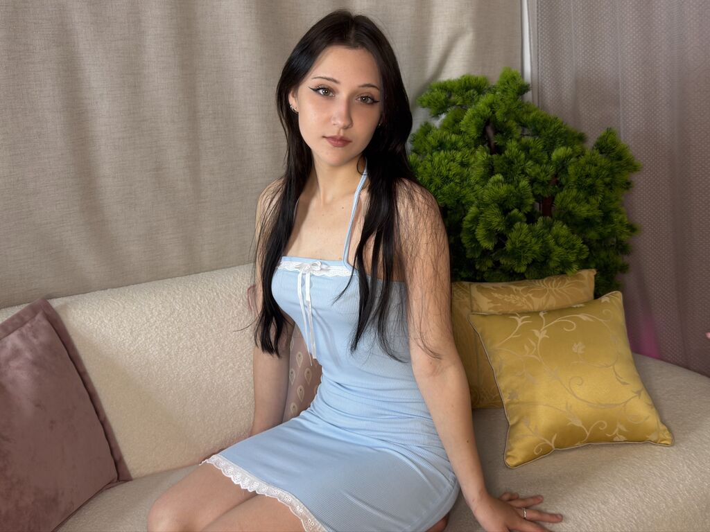 Room to try
 Easy room pick
 Worth opening
 Worth trying next
 Next room pick
 Worth a click
 Profile to open
ElenaCameron settles a room the way naturals do — quietly, without strain, and in a manner that holds up across time on camera.
More room-first profiles
Like ElenaCameron? Here's a set running along similar lines, each one a quick click away.
 A useful next room
 A useful pick
 A good next look
 One to notice
 Worth browsing
 Room to try
 A quick room pick
 A useful next room
 Clean room choice
 Featured room
 Room with some pull
 Another strong room
 Easy room pick
 Good next profile